ANTI®

ANTI Creative Finance,

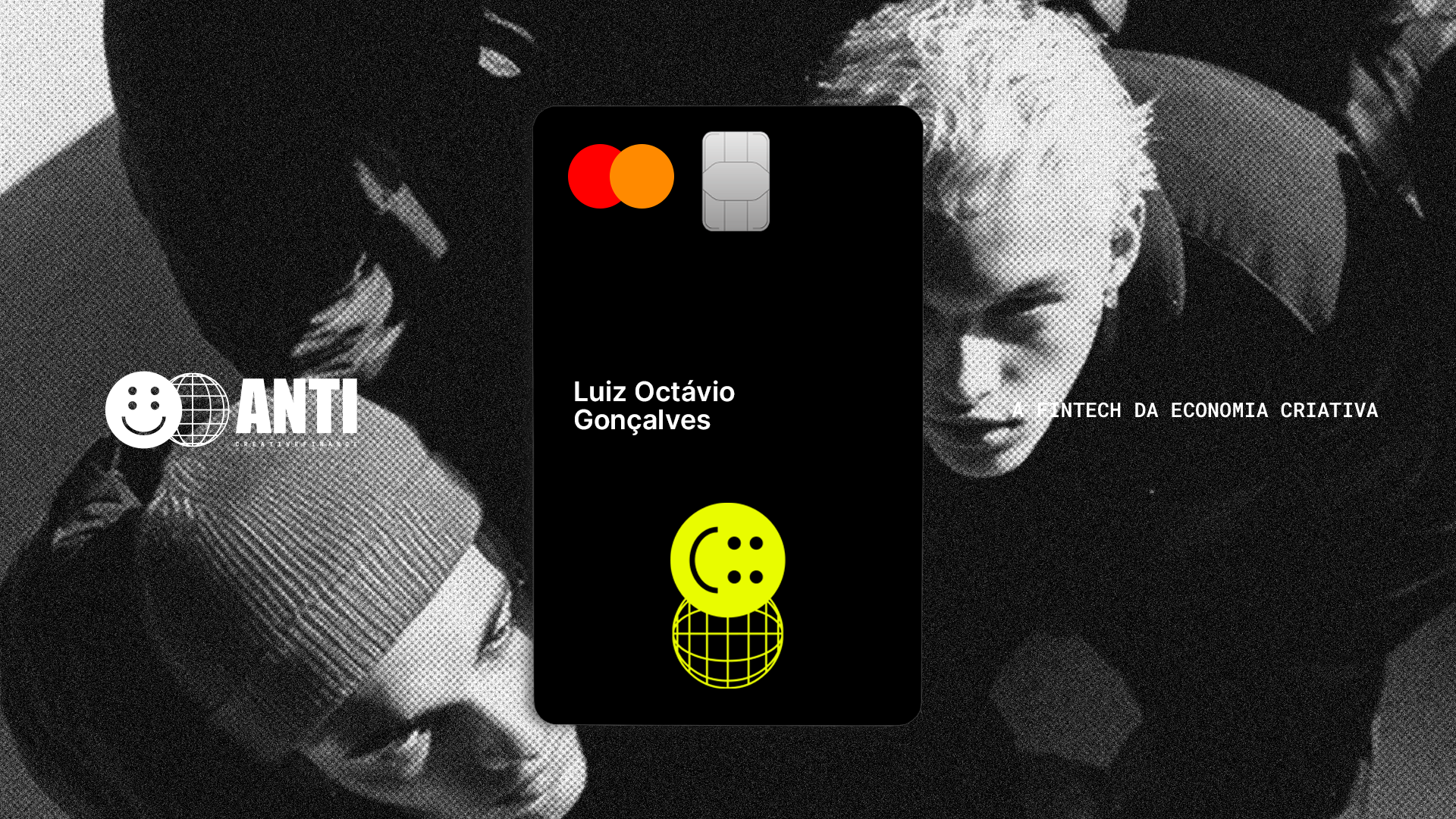
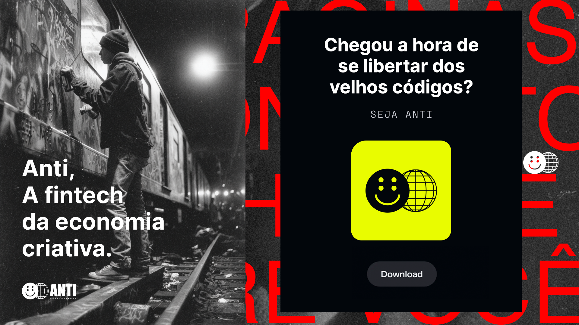
The fintech of the creative economy — a regulated financial operation, built for people who make a living creating.

Brand:
Year:
2026

The fintech of the creative economy. ANTI exists to build the financial infrastructure of the people who create — advancing contracts, unlocking money, and giving time back to those who need to be creating.

ANTI exists to build the financial infrastructure of the creative economy. One that doesn't exist yet — because the one that does was designed for other people. One where money works for those who create, instead of forcing those who create to work for money.

Operated within DUX Digital S/A and regulated by the CVM (Brazil's securities commission), ANTI advances contracts for branded content, jobs, and campaigns in up to 24 hours. It assesses the payer, not the creator's credit score. It approves in an hour, pays the same day, and gives creators back what they have least of: time to keep creating.

This brandbook translates that system into three parts: personality (manifesto, values, tone of voice), visual identity (logo, colors, typography, photography, motion), and architecture (how ANTI relates to the DUX Group and what comes next).
Personality

This section gathers ANTI's conceptual foundation: vision, mission, values, manifesto, archetypes, tone of voice. It's what defines the brand before form. The parts that follow — visual system, photographic language, applications — derive from here.

Mission

Deliver personalized financial solutions to the players of the creative economy, with agile, bureaucracy-free execution, focused on fostering the creative market.

Vision

To be the #1 bank in financial solutions for the Creative Economy in Latin America by 2029.

Values

Five non-negotiable principles that hold up everything ANTI does — from the product to the conversation.

01 / 05

Rigor underneath,
irreverence on top.

The operation works before any joke does.

What this value demands

That every brand claim has an operational fact behind it. That product craft, service, and process back up the tone. That provocation only shows up when there's substance to defend it. That we're not anti in name only.

02 / 05

Understand the craft.

ANTI knows the creative economy from the inside and keeps studying it every day. The traditional financial system never wanted to understand how creatives work. ANTI does the opposite.

What this value demands

Studying how creatives actually work — the payment cycles of each niche (branded content, film & video, events, music, design), the typical contracts, the recurring payers, the specific frictions. Talking to the creator, the agency, the production company, the studio, the event — not as research, but as a peer. Updating our read of the market periodically, because the creative economy changes fast (formats change, platforms change, the dynamics of pay change). Hiring people who know the sector from the inside, not just from the outside.
03 / 05

For, before against.

Every critique comes with a defense. In practice: whoever attacks the bank must, in the same breath, defend the creator.

What this value demands

Who is the critique defending? Who gains from it? That any action that criticizes articulates both sides — attack and defense — in the same context.

04 / 05

No fine print.

We don't hide and we don't try to deceive. If it needs translating, it's wrong.

What this value demands

Every relevant piece of information up front, no tiny footnote, no asterisk, no avoidable technical jargon. Personalized service and language the client understands without a dictionary. Rate, term, and conditions visible before confirming the transaction. Contracts with the important terms in the same size as the rest of the text.

05 / 05

Uncomfortably honest.

We're not heroes. We don't hide what we are; we expose the market's problems honestly and make ourselves available to try to solve them. We don't deceive the client with fine print and hidden information — we say what other brands soften.

What this value demands

Saying "no" without softening it when the answer is no. Naming the category of the reason (payer, term, amount) in rejections. Owning operational mistakes in the first person. Stating the product's real limitations. Talking about the financial market with the same frankness we'd use with a colleague from the creative economy. Not putting lipstick on a leech.

Archetypes

Archetypes are recognizable psychological figures — types with distinct postures in the world — used to describe how a brand acts, speaks, and decides.

Primary archetype

The Outlaw

The outlaw archetype represents the figure who rejects the established order when that order proves unjust, no longer makes sense, or was built to exclude someone. It's not rebellion for its own sake or for aesthetics: it's the posture of someone who realizes the prevailing system leaves people out, and decides to operate against that logic. Brands like MTV, Vice, and Apple are well-known examples of the archetype in action.

This archetype makes sense for ANTI because the brand is born out of that exclusion. The traditional financial system was designed for a client who isn't the creator: a fixed salary, a predictable history — anyone who makes a living creating is left out. The credit score reads them wrong, the account manager doesn't understand the craft, the product doesn't fit the cash flow of someone who works project by project. An agency waits 90 days to get paid for a one-week campaign; a creator is denied a line of credit because they have no payslip. ANTI exists because that exclusion is real. Choosing this archetype, in our case, isn't a choice of tone — it's the consequence of how the company sees the financial market for the creative economy.

The outlaw
  • Breaks rules without apologizing
  • Questions authority constantly
  • Says what others avoid
  • Takes narrative risk
How it shows up in copy
  • Direct sentences, no softening
  • Use of provocation
  • An "us against them" tone
Secondary archetype

The Jester

The Jester is the trickster archetype. It's the figure who uses humor, irony, and play to say what no one else can say with a straight face. In the medieval court, it was the only character licensed to mock the king without punishment — because laughter disarmed the offense. Applied to brands, it's the archetype of the one who reveals an uncomfortable truth through the lens of humor: ridicules what's wrong, exposes the absurdity of a situation, breaks the expectation. Brands like Oatly, Liquid Death, Old Spice, and The Onion are well-known examples of the archetype in action.

This archetype makes sense as ANTI's secondary one because it's the filter that keeps the Outlaw from turning superficial. On its own, the Outlaw becomes angry, too serious, without self-awareness — it turns into preaching. The trickster adds the missing layer: the brand's ability to laugh at itself, to acknowledge its own paradox (a CVM-regulated fintech called ANTI), and to disarm criticism before it becomes a pose. It also has a protective function: the mature trickster ridicules the system, not people.

The jester
  • Uses humor as a weapon
  • Irony to reveal truths
How it shows up in copy
  • Light or biting sarcasm
  • Unexpected comparisons
  • Breaking expectations
The relationship

Why the two together?

The reason is structural. The Outlaw is the brand's why — the anti-systemic thesis that holds everything up: the name ANTI, the mission, the operation that refuses the credit score. The Jester is the filter that keeps the Outlaw from turning into a teenager. The Jester alone is superficial, fun with no point. The Outlaw alone, too — childish revolt against the system. The combination is what matures the brand's personality.

In day-to-day execution, the Jester shows up more often. You don't want every post to be a manifesto against banks. Most of the time it's irony, lightness. The Outlaw appears at the pivotal moments — the manifesto, hero pieces, strong product decisions, institutional positioning.

Tone of Voice

Principles
01 / 04

Provocative

Provocation to name financial-market practices that are usually treated as natural.

What this means

The provocation has a target (the practice, the system, the competitor) and a purpose (to expose what others keep quiet): hidden fees, long payment terms, credit denied for lack of formal employment.

02 / 04

Ironic

ANTI uses irony to reveal the truth. The joke has to serve the thesis.

What this means

Ridicule the system, expose the absurdity of a situation, contrast two incompatible things. It can't be mere entertainment. We're a little chaotic, but always sharp.

03 / 04

Simple, direct, and honest

No legalese, no advertising romanticism. ANTI simplifies.

What this means

Two opposite registers that make the same mistake: one hides beneath technique, the other hides beneath aesthetics. Without hiding relevant information in the fine print.

04 / 04

Mature, not superficial

Trust comes from what the brand knows and what it delivers — not from an inflated tone or forced familiarity.

What this means

The reader is treated as an equal in ability. ANTI doesn't underestimate its audience, nor does it try to fool them with aesthetics, silly slang, or forced familiarity.

Tone of voice and the archetypes

The Outlaw

Breaks rules without apologizing.
Questions what no one questions.
Says what others avoid. Willing not
to be unanimous.

In copy: direct sentences, no softening. Provocation
with a clear target. The tone of someone on the side of those
who create — not someone against somebody.

When it leads: manifesto, hero pieces, institutional
positioning, communication that criticizes the financial market,
explicit refusal, statements of limits and principles.

The Jester

Uses humor as a weapon. Irony with
a thesis, not a pose. Ridicules the
system, not people.

In copy: light or biting sarcasm.
Unexpected comparison. Breaking of
expectation.

When it leads: social media, microcopy,
reaction to news or culture, everyday
copy, moments when the brand needs to laugh
at itself, short texts.

What we
don't do

01. Excessive formality and legalese

Complex constructions, Latin, legal formulas used when there's a direct alternative. It distances and protects, it doesn't communicate.

02. Advertising romanticism and unfounded promises

Impact adjectives, empty superlatives, claims bigger than the delivery.

"A transformative experience, revolutionizing the way creators relate to money."

03. Over-explaining

Text that repeats, over-justifies, or explains the obvious. It shows distrust of the reader.

"You know when you're a creator, you close a contract… We understand that pain…"

04. Underestimating or deceiving the user

Vague formulas to soften rejections, errors, or real limitations. Instead of explaining, it avoids.

"We couldn't complete your transaction at this time. Please try again later."

05. Overusing slang and forced humor

Language that projects youth or forced belonging. The "angry teenager" we want to avoid. Careful with trends.

06. False solidarity

Phrases that fake partnership or affection in a relationship that is commercial.

"We're in this together," "we're a team," "more than clients, we're partners."

Slogans &
Key Messages

Manifesto

Id. Visual

Esta seção reúne os componentes visuais da marca: logo, cor, tipografia, grafismos, fotografia, motion, aplicações e parcerias. É onde a tese da seção anterior ganha expressão visual. Cada componente deriva dos princípios e do tom já definidos.

Iconografia de apoio

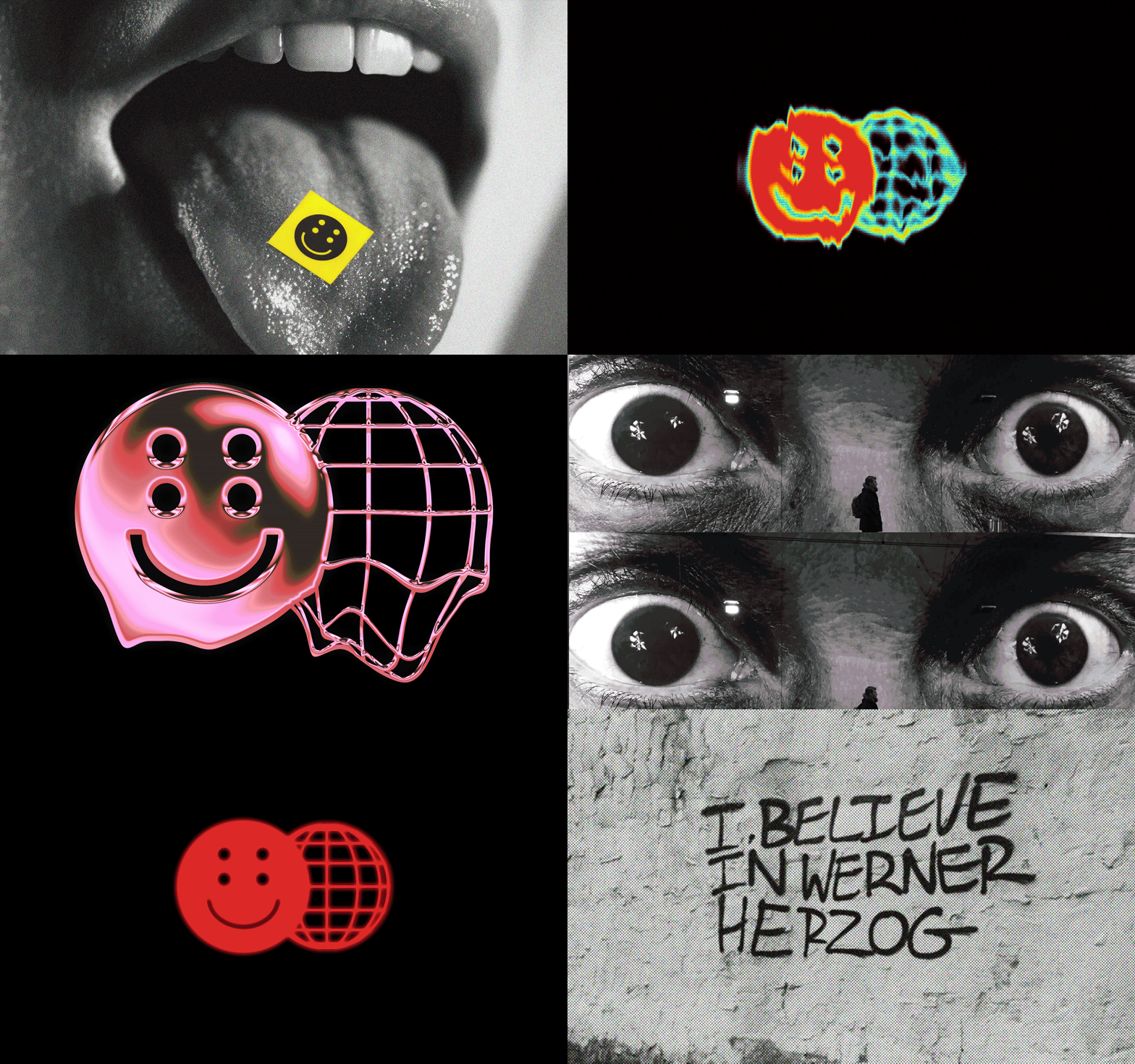
Alguns ícones e visualizações criados durante o desenho do logo que farão parte do universo visual da marca.

Iconografia 01
Iconografia 03
Iconografia 04
Iconografia 06
Iconografia 08
Iconografia 09
Iconografia 10
Iconografia 11
Iconografia 12
Iconografia 13
Iconografia 14

Cores

A paleta da ANTI é dividida em duas cores principais (preto e verde) e duas secundárias (vermelho e branco). Preto e verde formam a base da marca em qualquer aplicação. O vermelho aparece como alerta pontual; o branco como respiro estrutural.


Principal Preto
HEX #000000
RGB 0 / 0 / 0
CMYK 0 0 0 100
Pantone Black C
Principal Verde?
HEX #E9FC00
RGB 233 / 252 / 0
CMYK 8 0 100 0
Pantone 396 C
Secundária Vermelho
HEX #F61F3E
RGB 246 / 31 / 62
CMYK 0 87 75 4
Pantone 185 C
Secundária Branco
HEX #FFFFFF
RGB 255 / 255 / 255
CMYK 0 0 0 0
Pantone White

Hierarquia

Preto e verde dominam a marca. Vermelho e branco entram em apoio — pequenos, pontuais, nunca como base. O quadro abaixo mostra a proporção ideal de uso.

Principal · 40%
Preto #000000
Principal · 40%
Verde #E9FC00
Secundária · 10%
Vermelho #F61F3E
Secundária · 10%
Branco #FFFFFF

Combinações aprovadas

Estas são as cinco aplicações de marca que mantêm a personalidade Anti em qualquer suporte.

Verde sobre Preto
Preto sobre Verde
Preto sobre Vermelho
Vermelho sobre Verde
Branco sobre Vermelho
Vermelho sobre Preto
Vermelho sobre Branco

Tipografia

O sistema tipográfico da ANTI usa quatro famílias com funções distintas. Neue Haas Grotesk Display como voz de impacto nos títulos, Inter como clareza no corpo de texto, Roboto Mono para dados e labels técnicos, e VCR OSD Mono como acento retro e irreverente — um eco da estética anti-sistema.

Família Display

Neue Haas Grotesk Display

Uso Títulos, headlines,
peças publicitárias.
Pesos 300 / 400 / 500 / 700 / 900
Licença Adobe Fonts
(Creative Cloud)

ANTI — a fintech da economia criativa.

ABCDEFGHIJKLMNOPQRSTUVWXYZ
abcdefghijklmnopqrstuvwxyz
0123456789 — & @ # % ? !

Light 300 a fintech da economia criativa
Regular 400 a fintech da economia criativa
Medium 500 a fintech da economia criativa
Bold 700 a fintech da economia criativa
Black 900 a fintech da economia criativa

Neue Haas Grotesk Display é a fonte original da qual a Helvetica foi derivada — com mais personalidade, espaçamento mais refinado e presença visual que funciona muito bem em telas. A voz de impacto da ANTI: fria, técnica e com caráter.

Família Texto

Inter

Uso Texto, interface,
títulos e leitura corrida.
Pesos 300 / 400 / 500 / 600 / 700
Licença Open Source
(SIL Open Font License)

ANTI — a fintech da economia criativa.

ABCDEFGHIJKLMNOPQRSTUVWXYZ
abcdefghijklmnopqrstuvwxyz
0123456789 — & @ # % ? !

Regular 400 Antecipamos o que já é seu.
Medium 500 Antecipamos o que já é seu.
SemiBold 600 Antecipamos o que já é seu.
Bold 700 Antecipamos o que já é seu.

A Inter é a voz padrão da ANTI — a tipografia de todo texto longo, todo cabeçalho, todo botão. Foi escolhida porque desaparece em serviço da clareza: neutra sem ser fria, legível em qualquer tamanho.

Fonte de Apoio

Roboto Mono

Uso Labels, dados,
especificações técnicas.
Pesos 400 / 500
Licença Open Source
(Apache License 2.0)

HEX #E9FC00
RGB 233 / 252 / 0

ABCDEFGHIJKLMNOPQRSTUVWXYZ
abcdefghijklmnopqrstuvwxyz
0123456789 — & @ # % ? !

Regular 400 Pantone 396 C · CMYK 8 0 100 0
Medium 500 Pantone 396 C · CMYK 8 0 100 0

Roboto Mono aparece nos dados, labels e informações técnicas do sistema. Sua largura fixa cria ritmo visual em tabelas e especificações — é a fonte que faz os números parecerem precisos.

Web-safe fallbacks

Web-safe fallbacks

Neue Haas Grotesk

Neue Haas Grotesk DisplayHelvetica NeueArial

Inter

InterHelvetica NeueArial

Roboto Mono

Roboto MonoSF MonoMenlomonospace

VCR OSD Mono

VCR OSD MonoRoboto Mono 700

Último recurso — manter peso forte

Fontes extras

Algumas fontes não google que podem ser usadas pela equipe de design da marca em situações específicas.

01

Impact

A fonte do logo ANTI. Deve ser usada de forma pontual e exclusivamente pela equipe interna — o uso frequente compromete a diferenciação da marca.

Anti

Pesos 400
Licença Fonte do sistema
Origem Windows / macOS

02

Trixy

Fonte da campanha de lançamento "Mande os Bancos Tradicionais pro Inferno". Pode voltar ao material como easter egg — uso exclusivo da equipe interna.

Hell

Estilos Stories: Regular, Medium, SemiBold
Tales: Light, Regular
Licença Uso interno
Origem assets/TRIXY

03

VCR OSD Mono

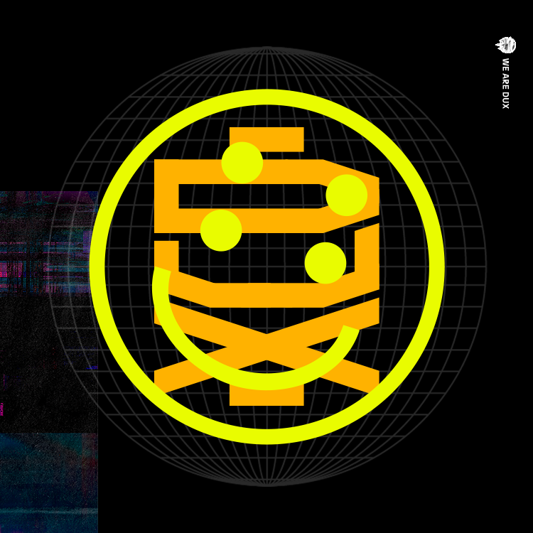
Parte da identidade visual da DUX. Pode ser usada na ANTI como storytelling visual que conecta as duas marcas.

We are DUX

Pesos 400
Licença Free for use
Origem assets/fonts

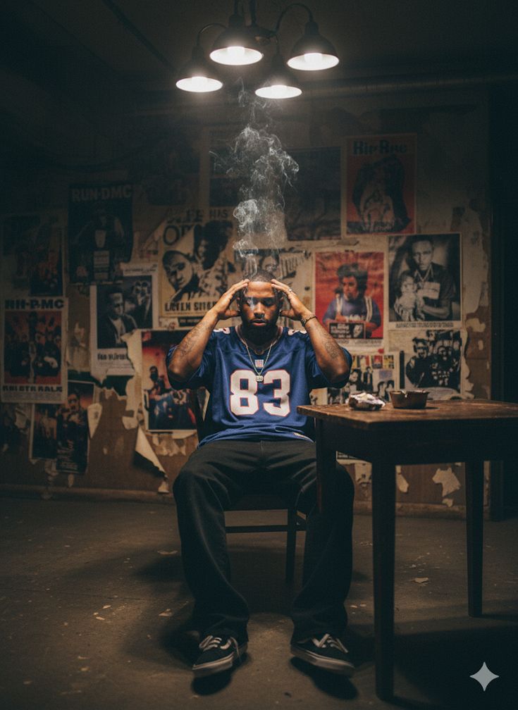
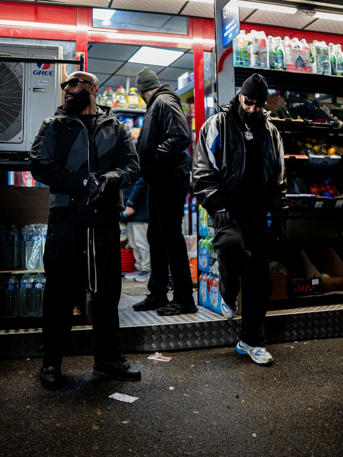
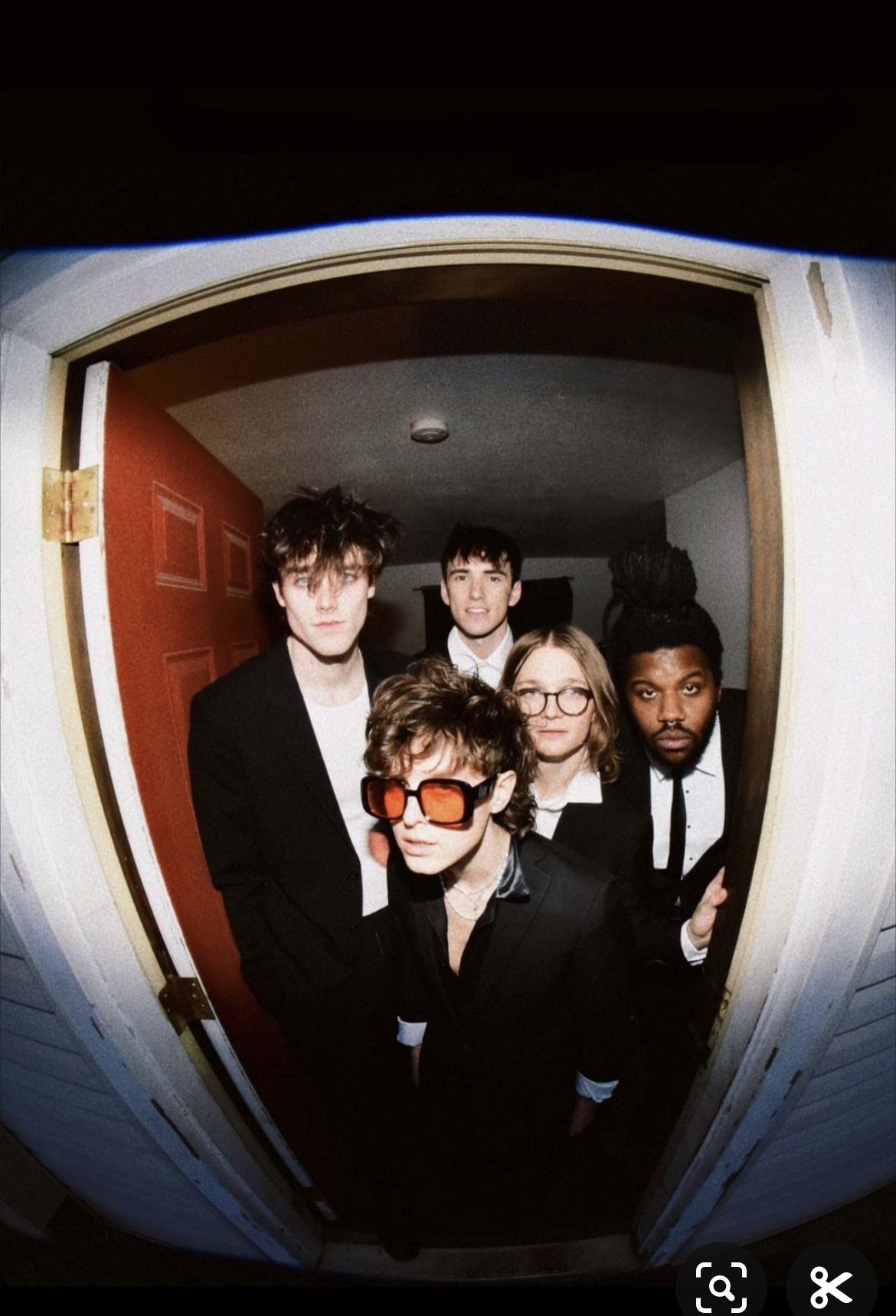
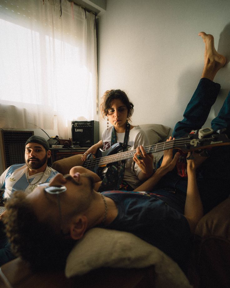
Linguagem fotográfica

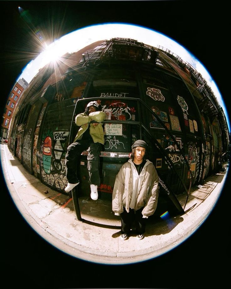
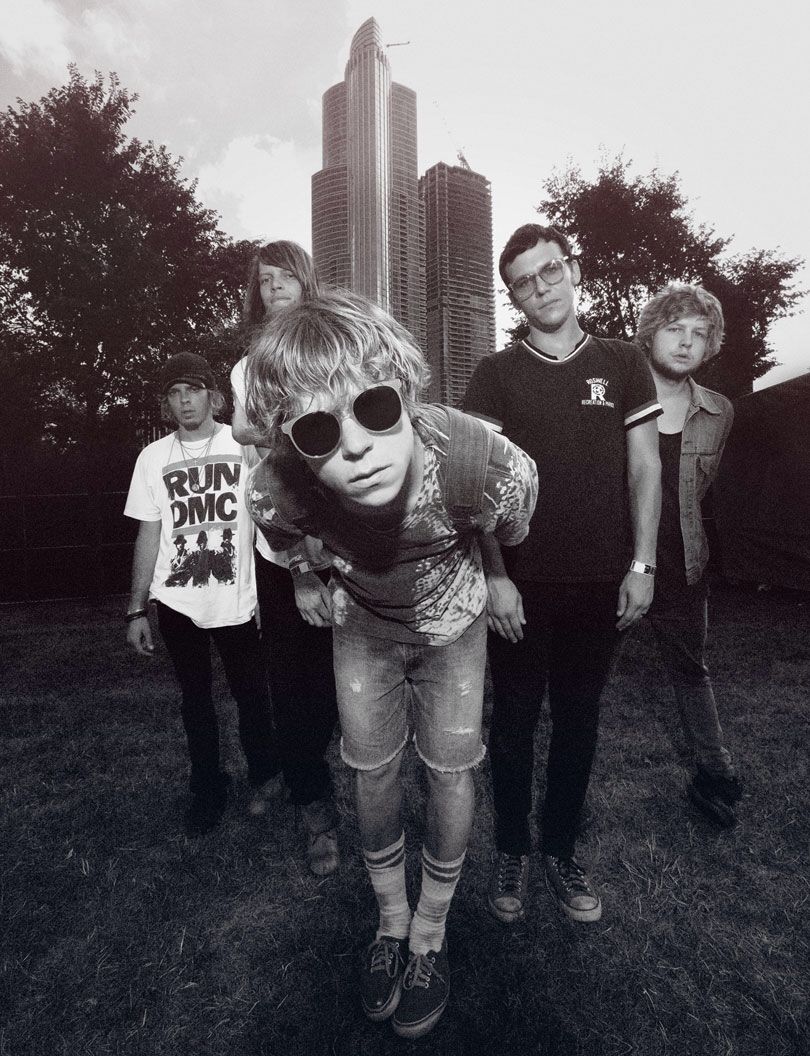
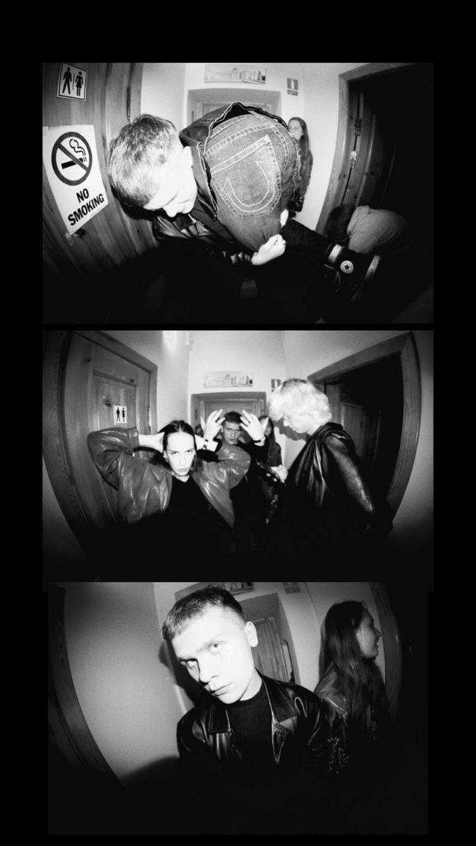
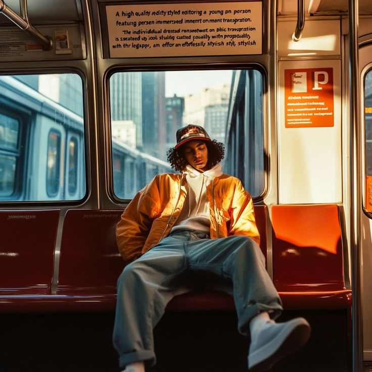
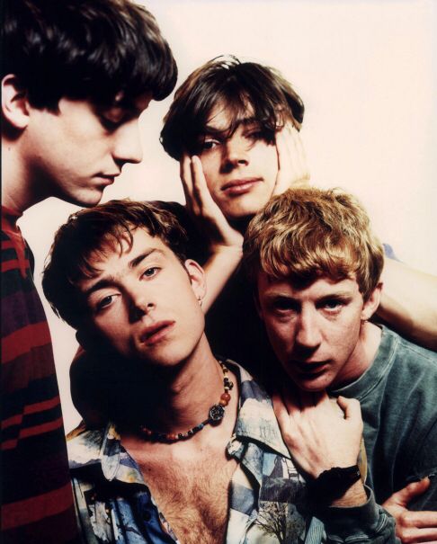
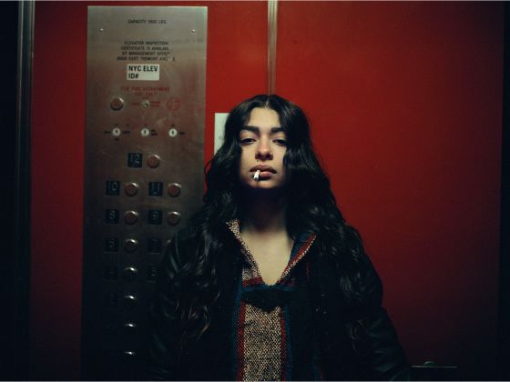
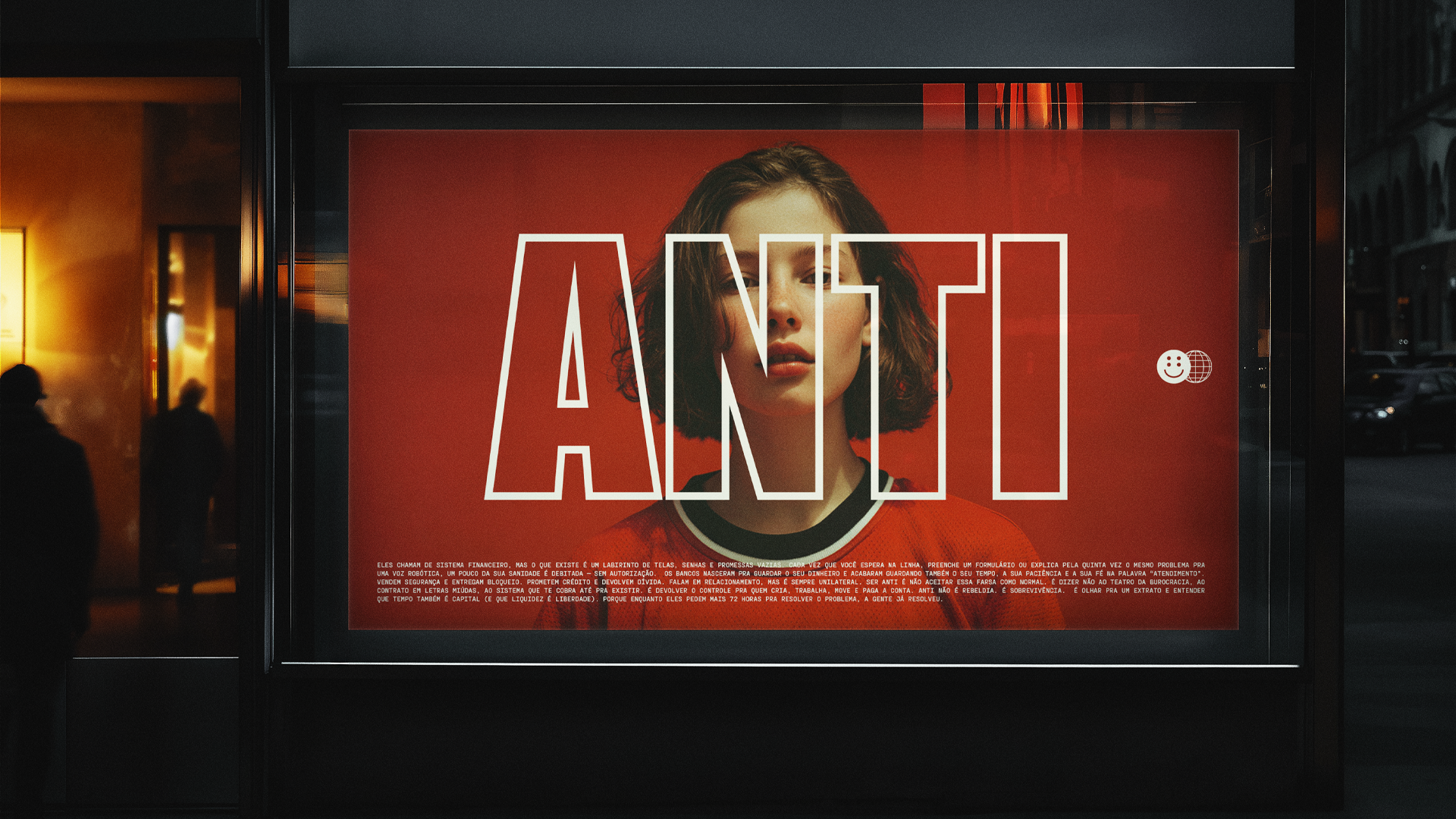
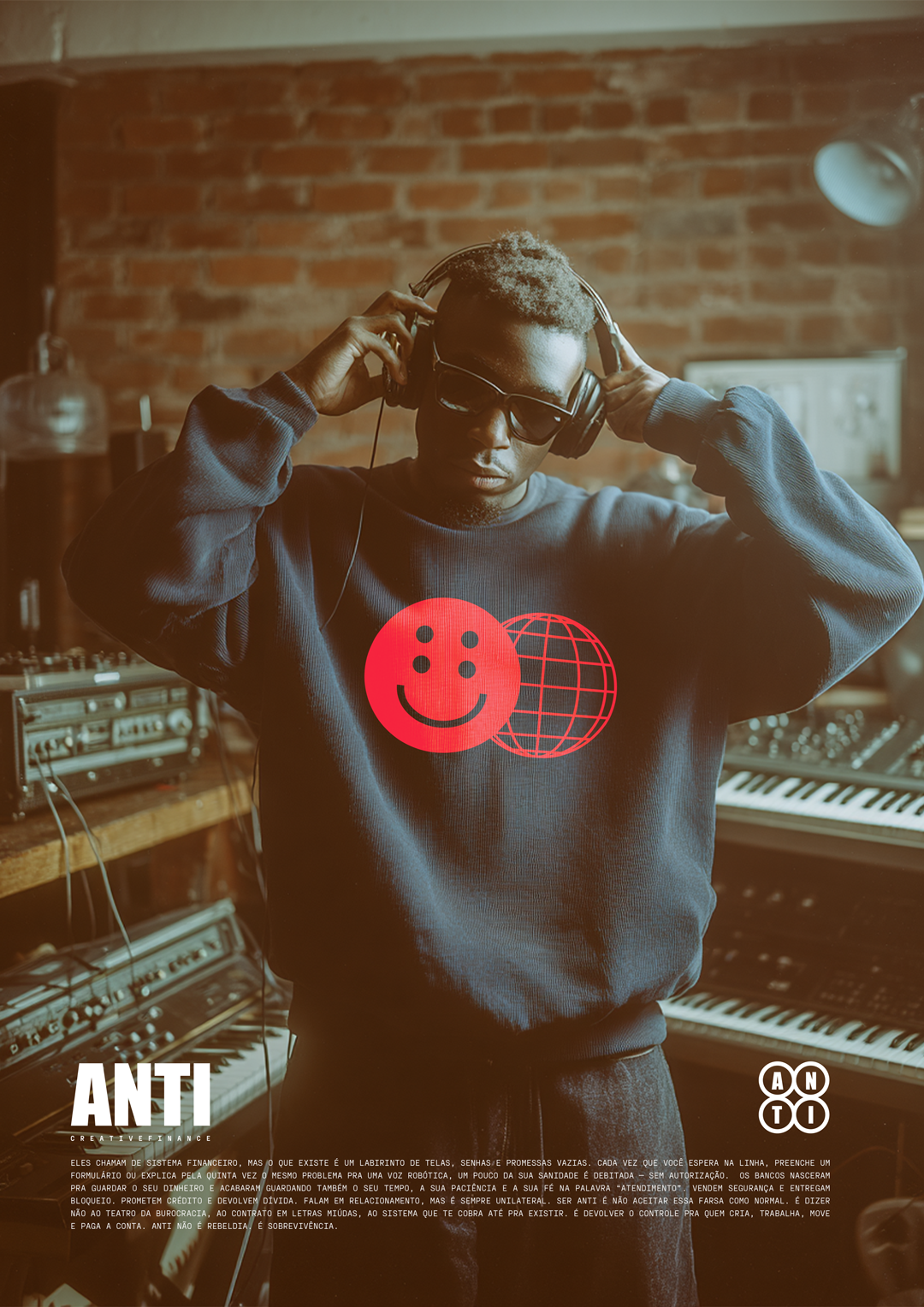
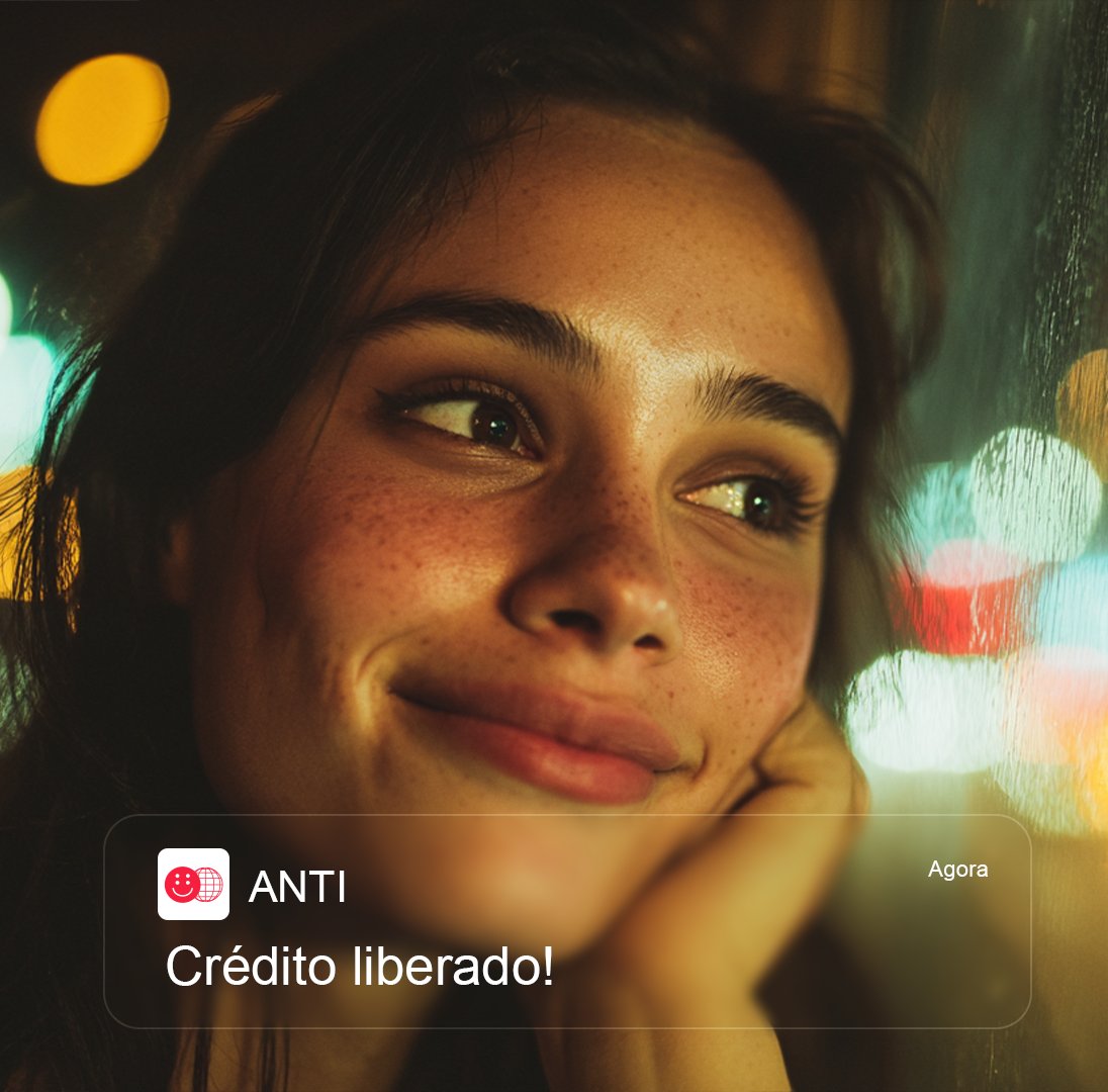
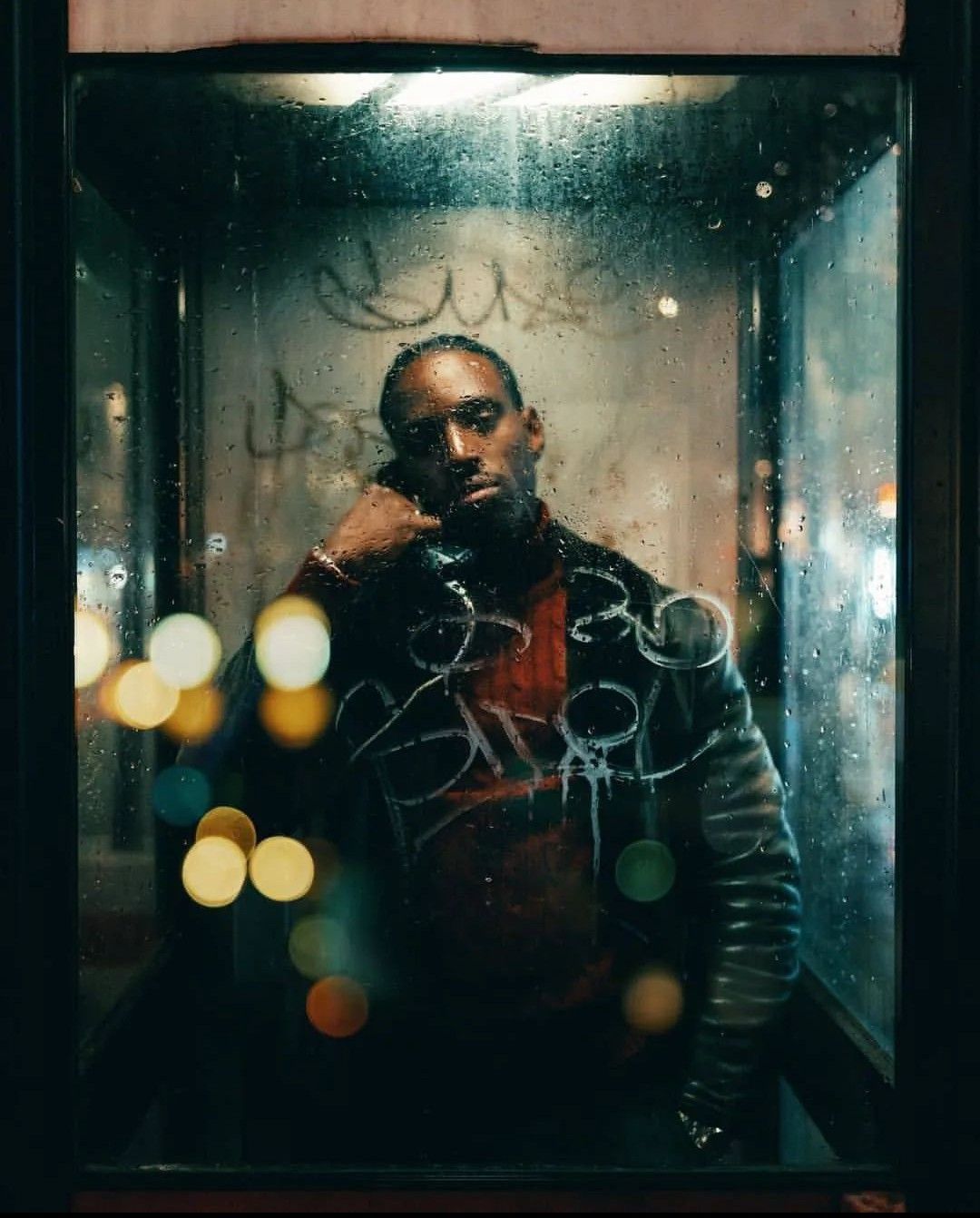
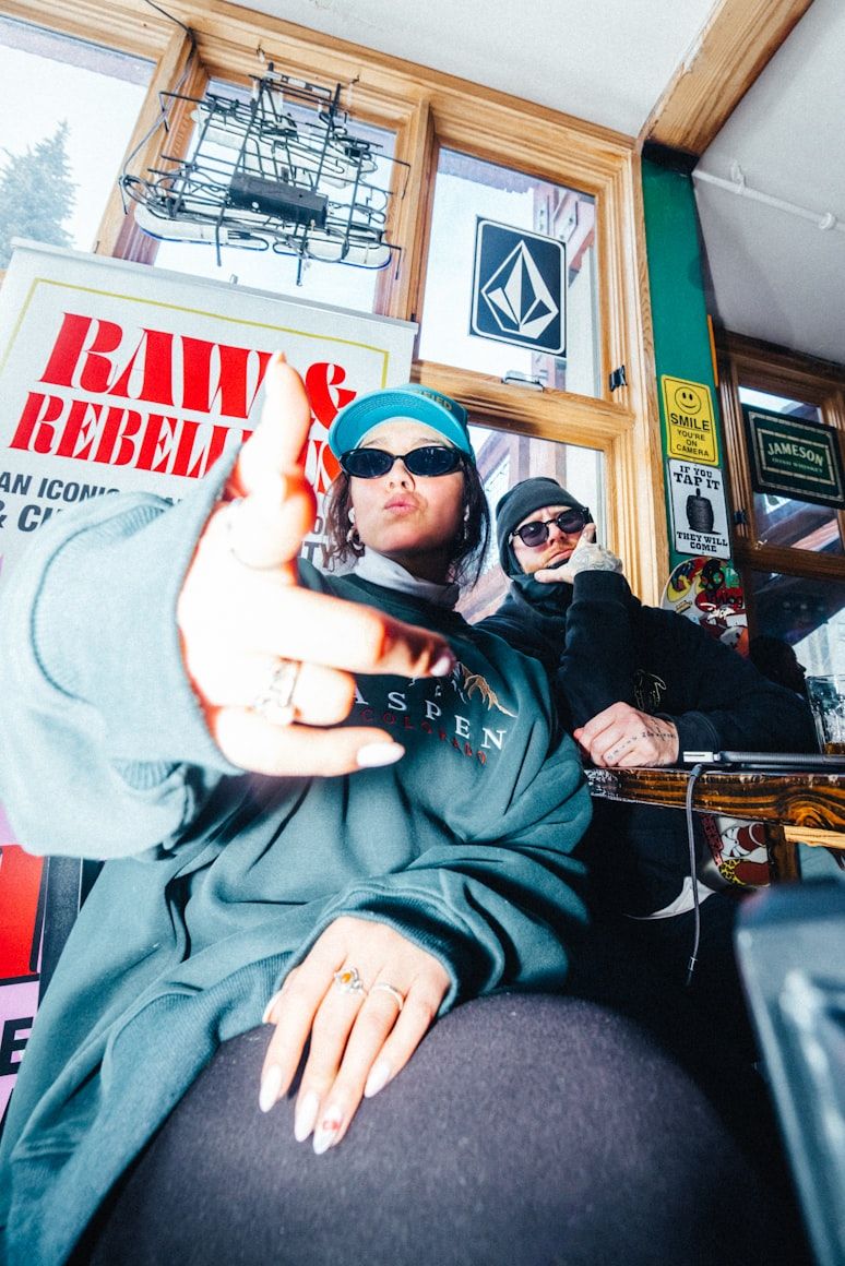
A imagem da ANTI trata a atitude e o sentimento como protagonistas, sem sorriso comercial de stock images. Lugar real, luz e composição como decisão visível, textura muito bem-vinda. A iconografia de banco e fintech genérica (pessoa sorrindo com celular, mão sobre laptop, iluminação par sem sombra) não é o caminho. Inspiração forte e direta em fotografia de música e moda.

#fashioneditorial #bandpromo #streetportrait #filmphotography #musicphotography #cinematicportrait #lynchianphotography
01 / 05

Presença, não apenas simpatia.

Nem sempre sorrindo, às vezes sério, irônico, contemplativo ou desafiante.

O que isso significa

Fugir da fotografia clássica de stock photo que permeia todos os bancos, fintechs e afins. O rosto e a postura falam antes da legenda.

02 / 05

Lugar real como personagem.

Rua, livraria, metrô, bar, sala com amplificador, backstage.

O que isso significa

Onde a economia criativa acontece. Nunca cenário aspiracional genérico — o ambiente carrega a narrativa tanto quanto a pessoa enquadrada.

03 / 05

Composição editorial e variação de ângulos e lentes.

Fisheye, ângulos variados, simetria, enquadramento que usa o ambiente como moldura.

O que isso significa

Brincar com as sombras ou reflexos. A imagem é construída, uma pitada de fotografia de arte. Não existe o ângulo "padrão".

04 / 05

Textura é MUITO bem-vinda.

Grão de filme, distorção de lente, riscos de chuva no vidro, flash, marcas de sticker, parede com história.

O que isso significa

A imagem não é higienizada nem retocada à perfeição plástica. Imperfeição visual é sinal de autenticidade — não de descuido.

05 / 05

Surrealismo, MTV e Inteligência Artificial.

Anti não engana. Nunca devemos criar material com IA e tentar enganar nossos espectadores de que aquele vídeo foi filmado.

O que isso significa

Para isso a relação visual com IA em vídeo deve buscar o surrealismo, criando uma imagética onde o sentimento principal vai ser "isso só seria possível com IA, e tudo bem". A referência nonsense das vinhetas da MTV pode guiar o processo aqui.

Elementos visuais

Recursos gráficos que ampliam a marca além do logo. Cada elemento carrega uma lógica própria e pode funcionar de forma autônoma dentro do ecossistema ANTI.

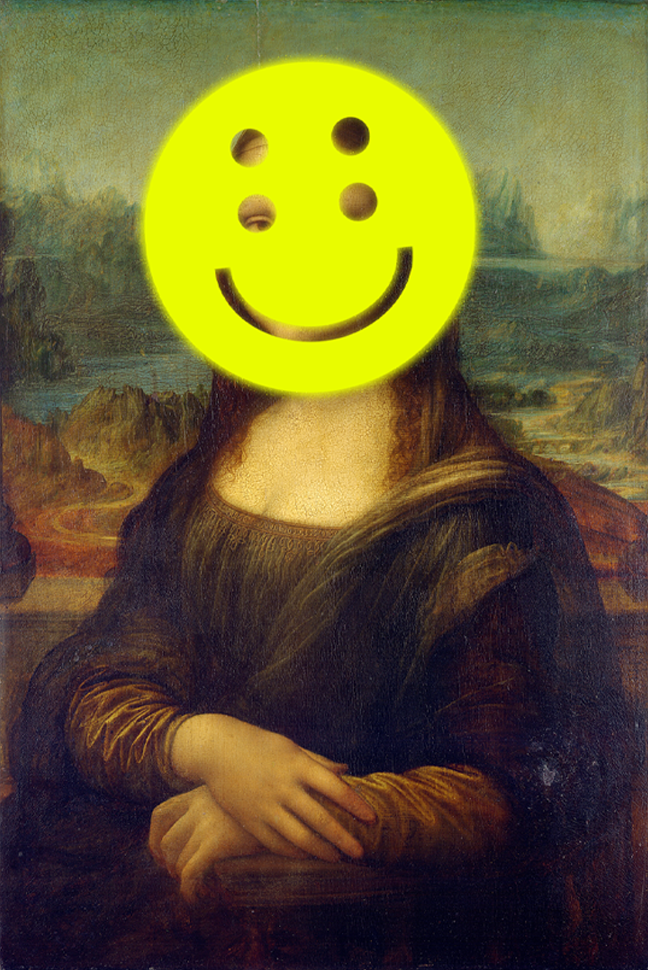
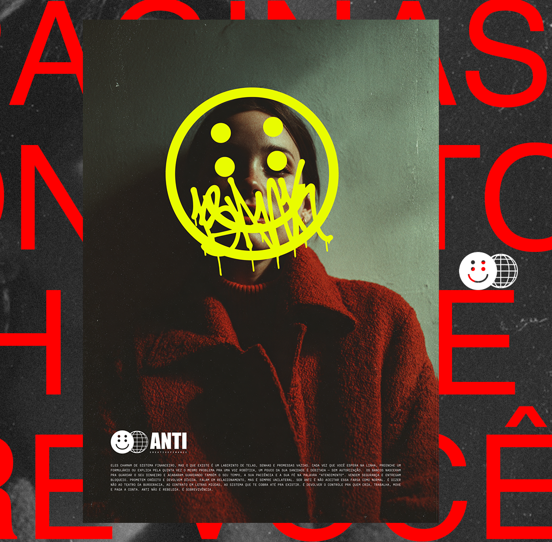
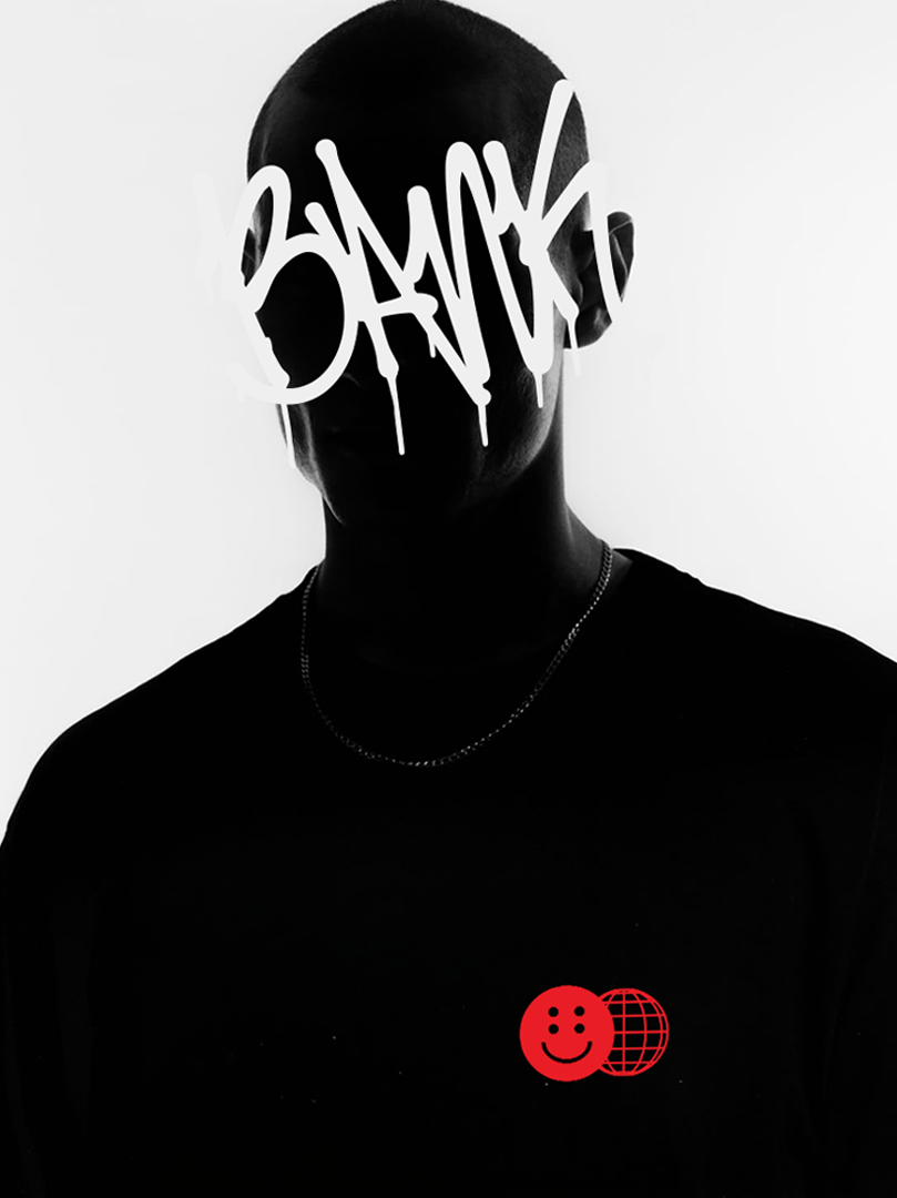
O smile como máscara

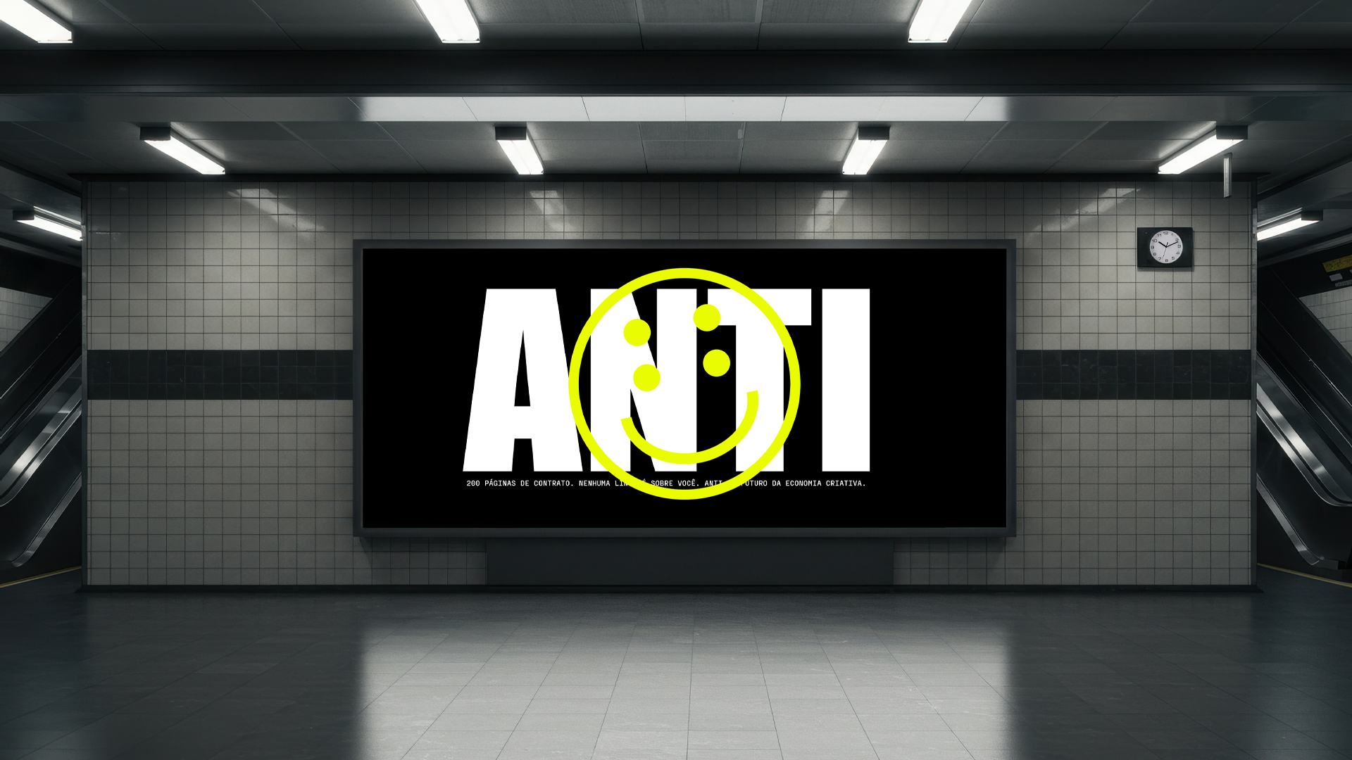
O smile é aplicado como máscara em cima de fotografias. Cobre o rosto e substitui o sujeito pelo símbolo da marca. Quem aparece na imagem vira parte do @sejaanti em vez de uma identidade individual. O movimento funciona assim: qualquer pessoa que vista o smile entra. A foto deixa de ser sobre quem está embaixo da máscara e passa a ser sobre a posição que essa pessoa decidiu ocupar. O personagem existe independentemente de quem está embaixo dele.

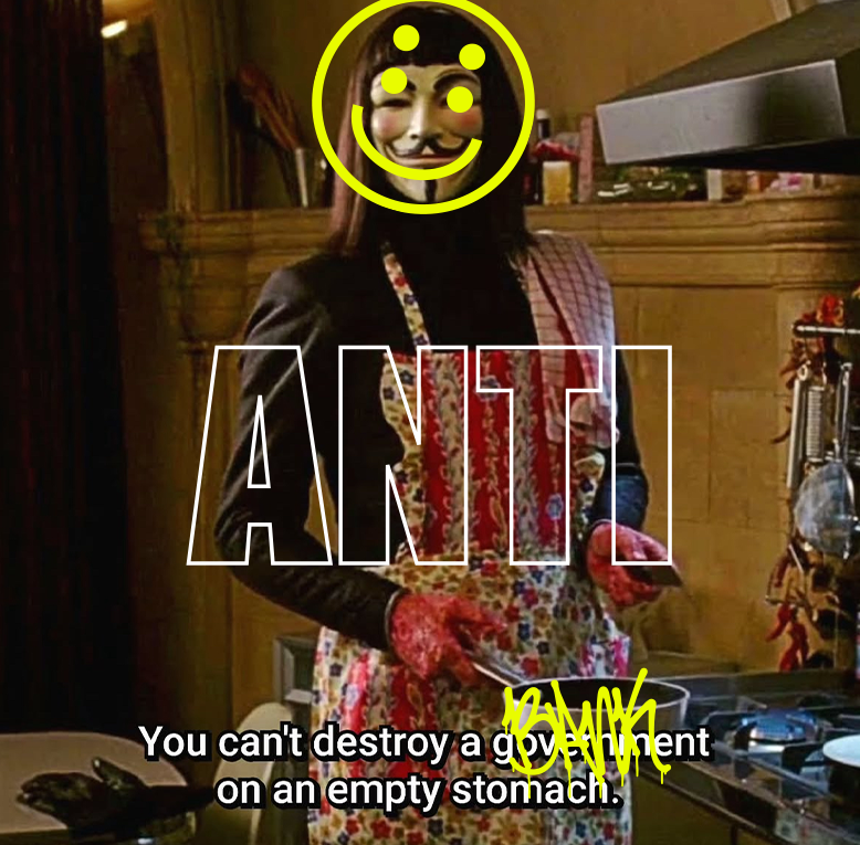
Os 4 olhos

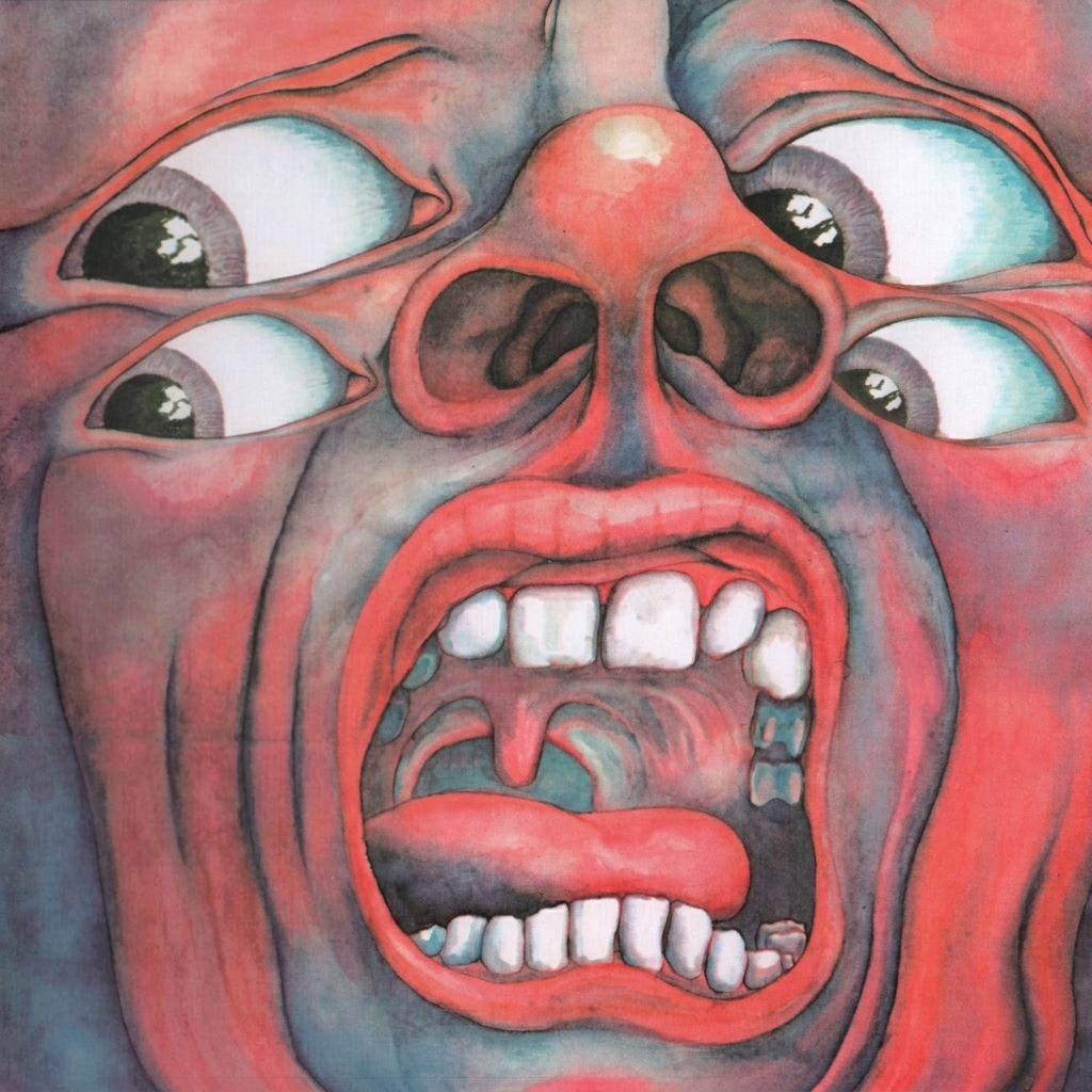
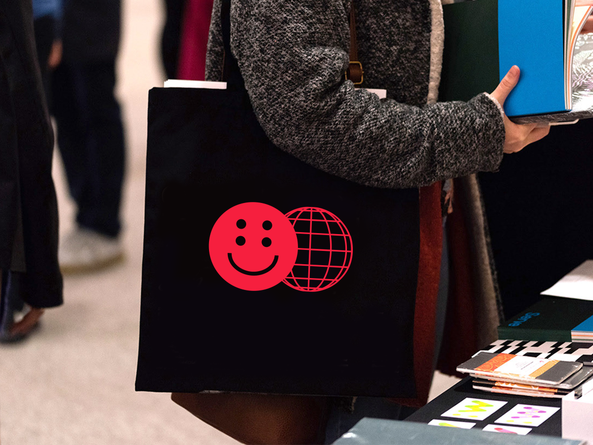
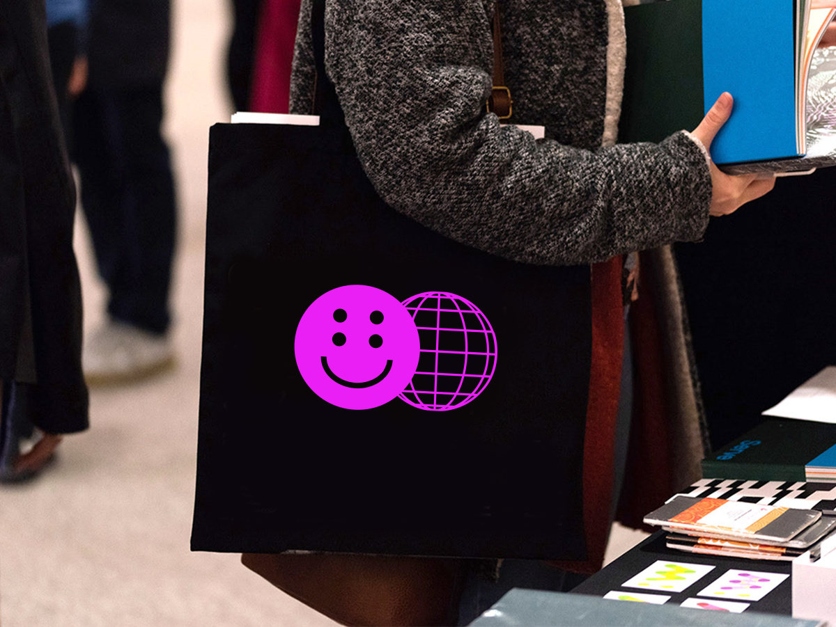
O smile da ANTI tem quatro olhos. Quando esse mesmo recurso é aplicado fora do logo, o gesto é simples: pega uma imagem existente — foto, obra clássica, referência cultural — e adiciona mais um par de olhos onde já existe um. Os quatro olhos somam: a imagem original continua reconhecível, mas marcada pela nossa assinatura.

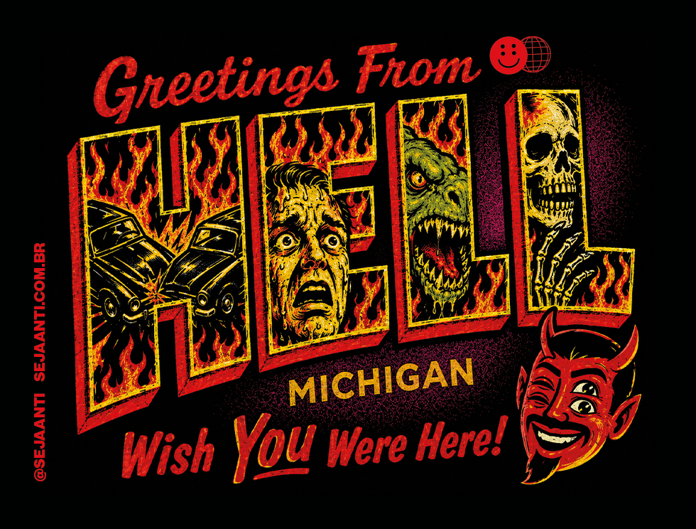
Mande os Bancos Tradicionais pro Inferno

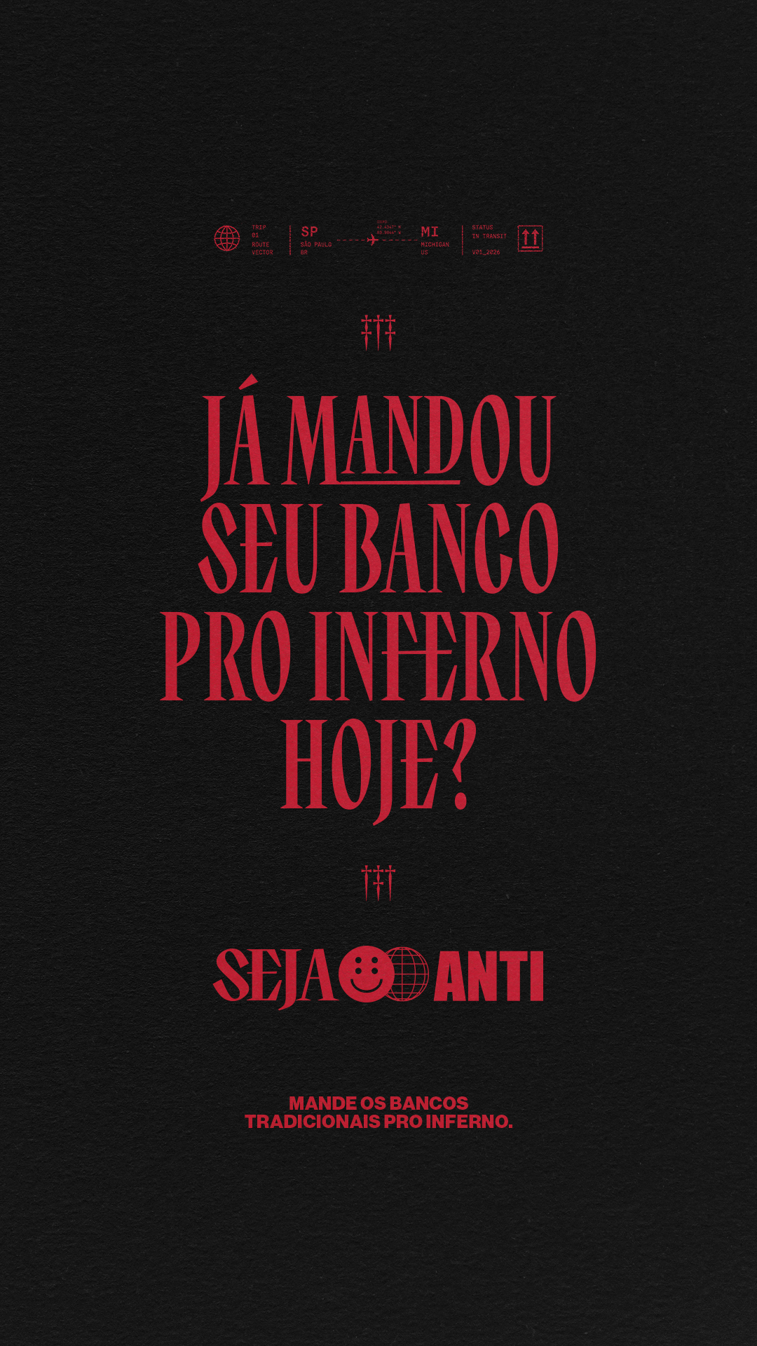
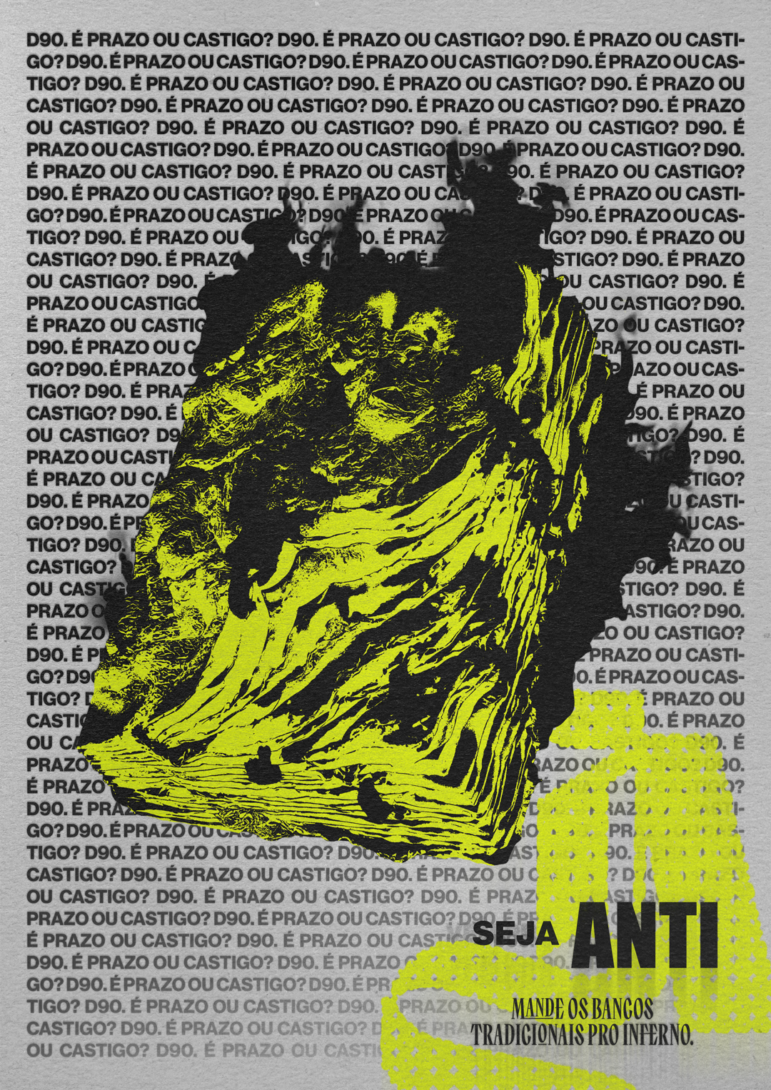
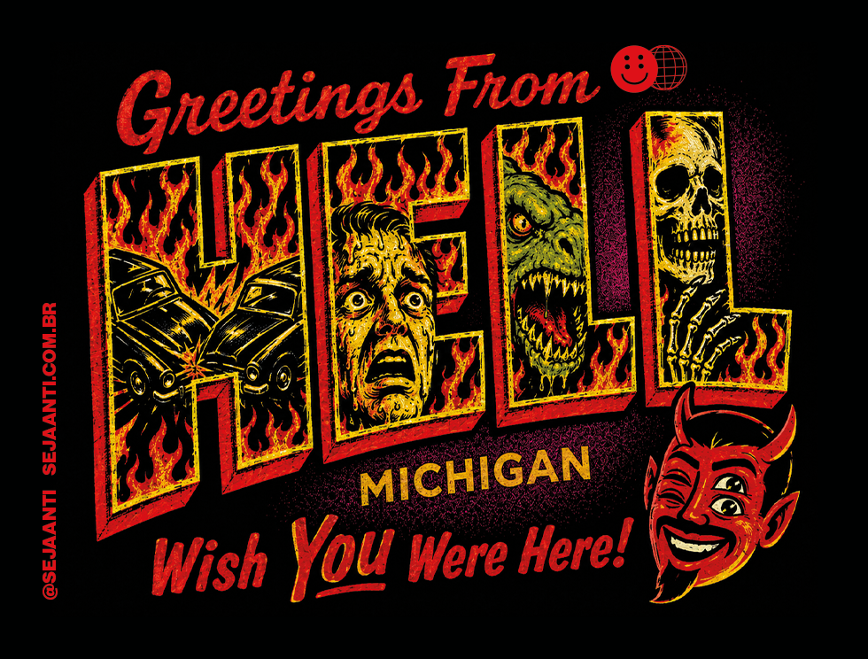
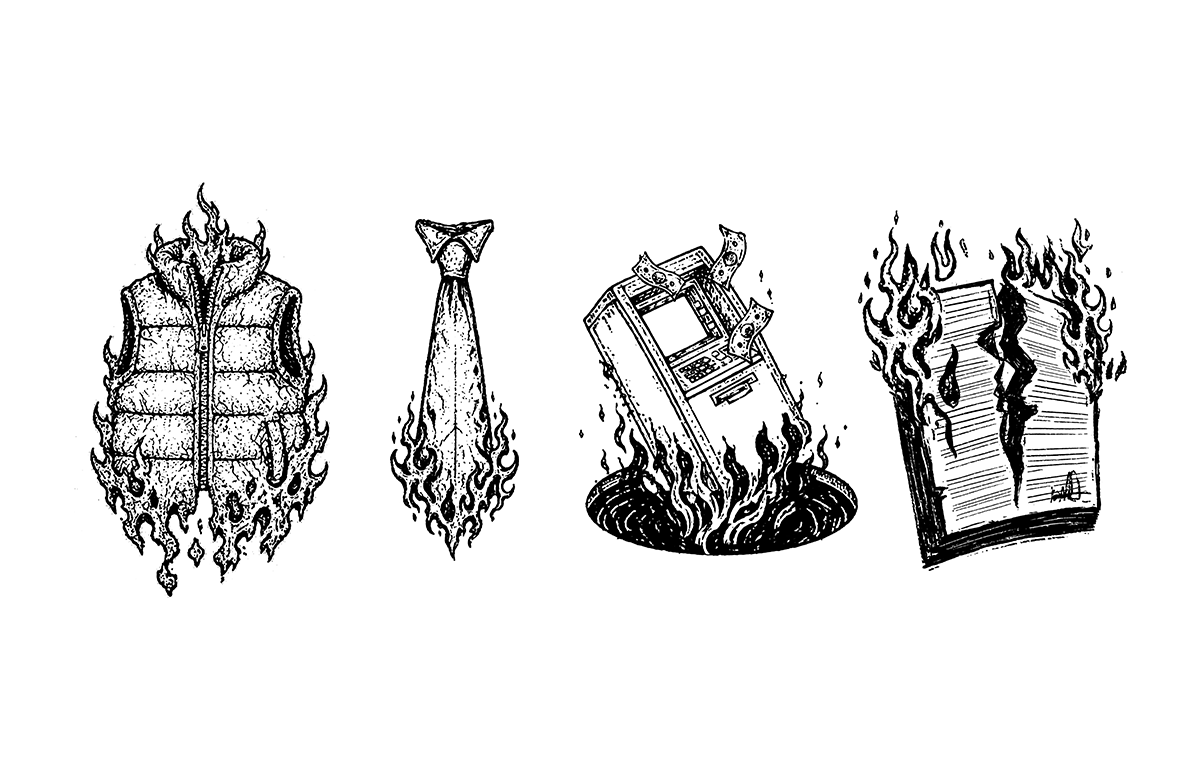
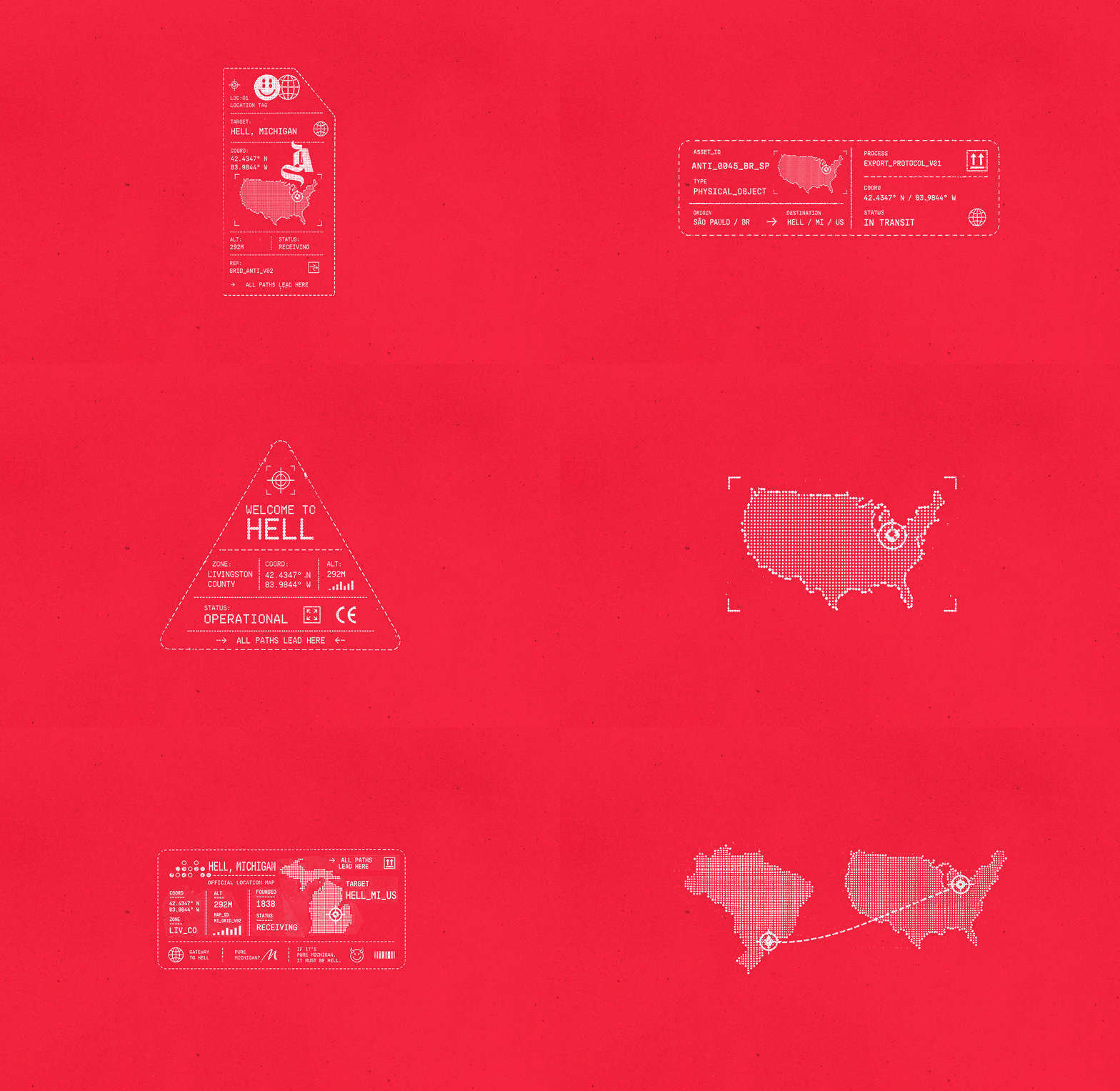
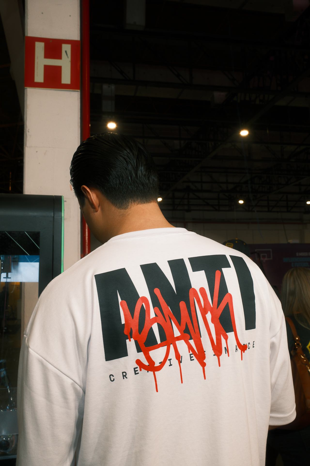
Na campanha de lançamento: Mande os Bancos Tradicionais pro Inferno, embalamos os objetos mais clássicos do sistema financeiro tradicional e enviamos para a cidade de Hell, Michigan. Alguns dos elementos dessa campanha, bem como o conceito de atear fogo (metaforicamente?) no sistema vigente vão permanecer na marca e podem ser usados no contexto certo. Nós da Anti entendemos que a campanha de lançamento sempre vai fazer parte da nossa história e usar alguns conceitos dela pra se autorreferenciar sempre vai fazer sentido.

Dos & Don'ts

Referências práticas do que funciona e do que foge da identidade ANTI.
Use como guia rápido antes de aprovar qualquer peça.

01

Não use cores fora da paleta

Sempre respeite a paleta oficial e as combinações aprovadas.

Certo

×Errado

02

Não distorça o logo

Esticar ou comprimir quebra as proporções. Sempre escale de forma proporcional, mesmo quando preocupado com o equilíbrio do quadro.

Certo

×Errado

03

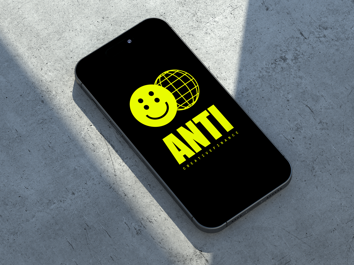
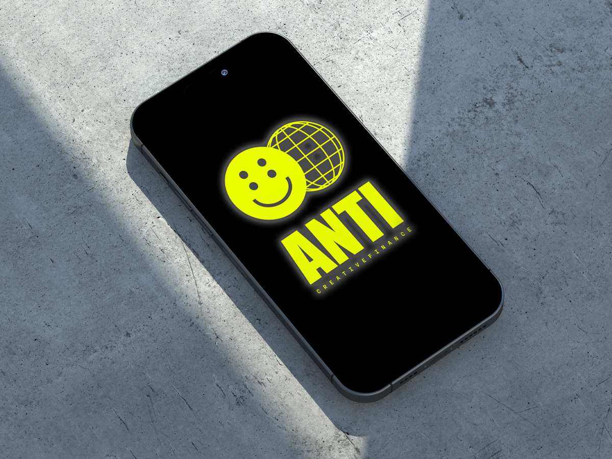
Não adicione efeitos

Sombras, gradientes e glows comprometem a limpeza.

Certo

×Errado

04

Respeite o tamanho mínimo

Em tamanhos muito pequenos os detalhes do smile desaparecem. Respeite as regras definidas na seção de "comportamento por tamanho".

Certo

×Errado

05

Não aperte o espaço

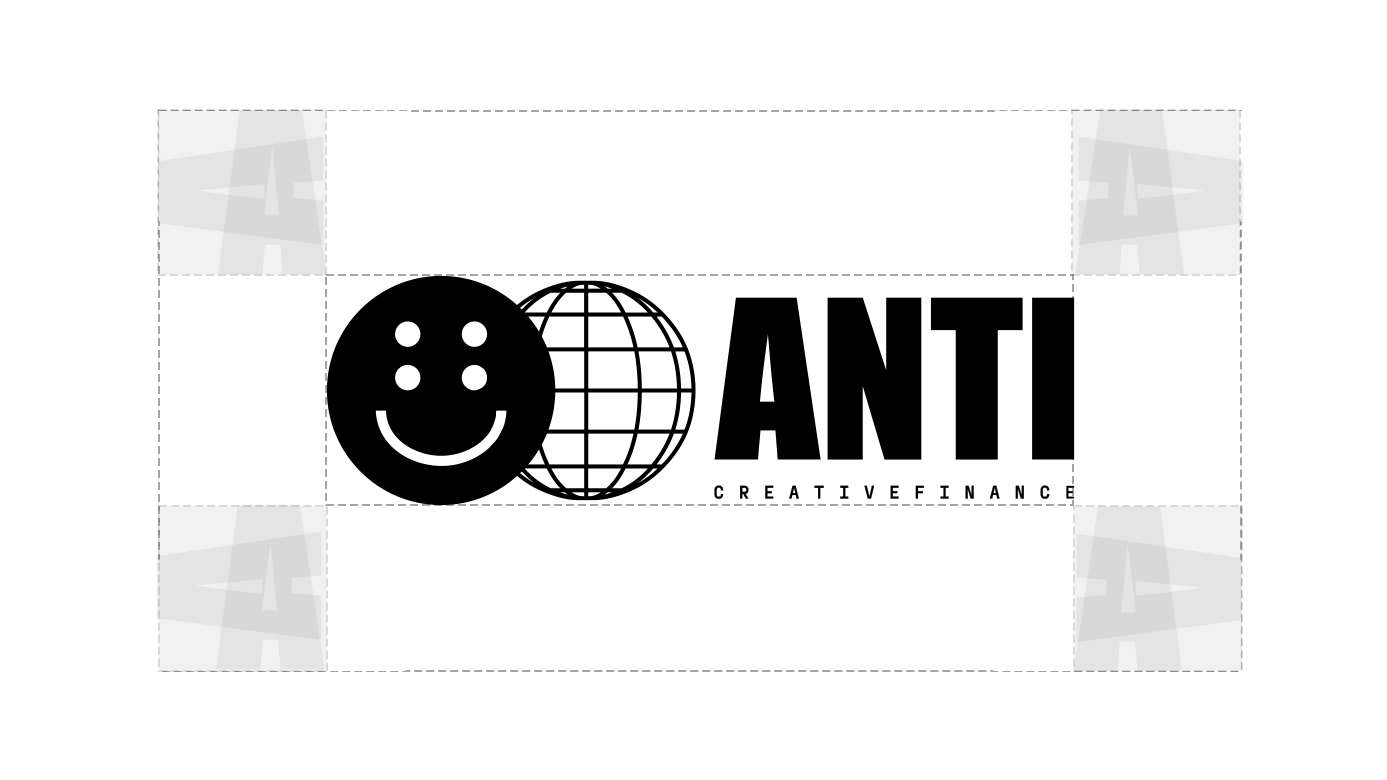
O logo precisa de respiro. Elementos colados comprometem a leitura e poluem a marca. Respeite as regras definidas na seção de "área de respiro".

Certo

×Errado

06

Não mexa nos elementos

Mantenha os elementos oficiais do logo como estão, mudanças podem atrapalhar o equilíbrio do desenho.

Certo

×Errado

In Use

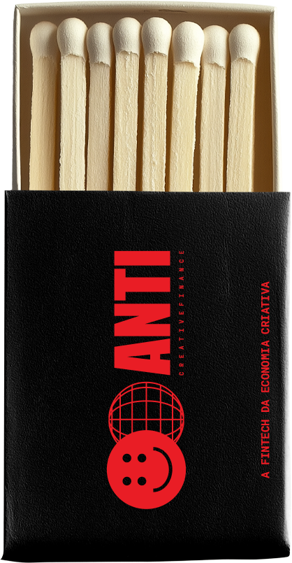
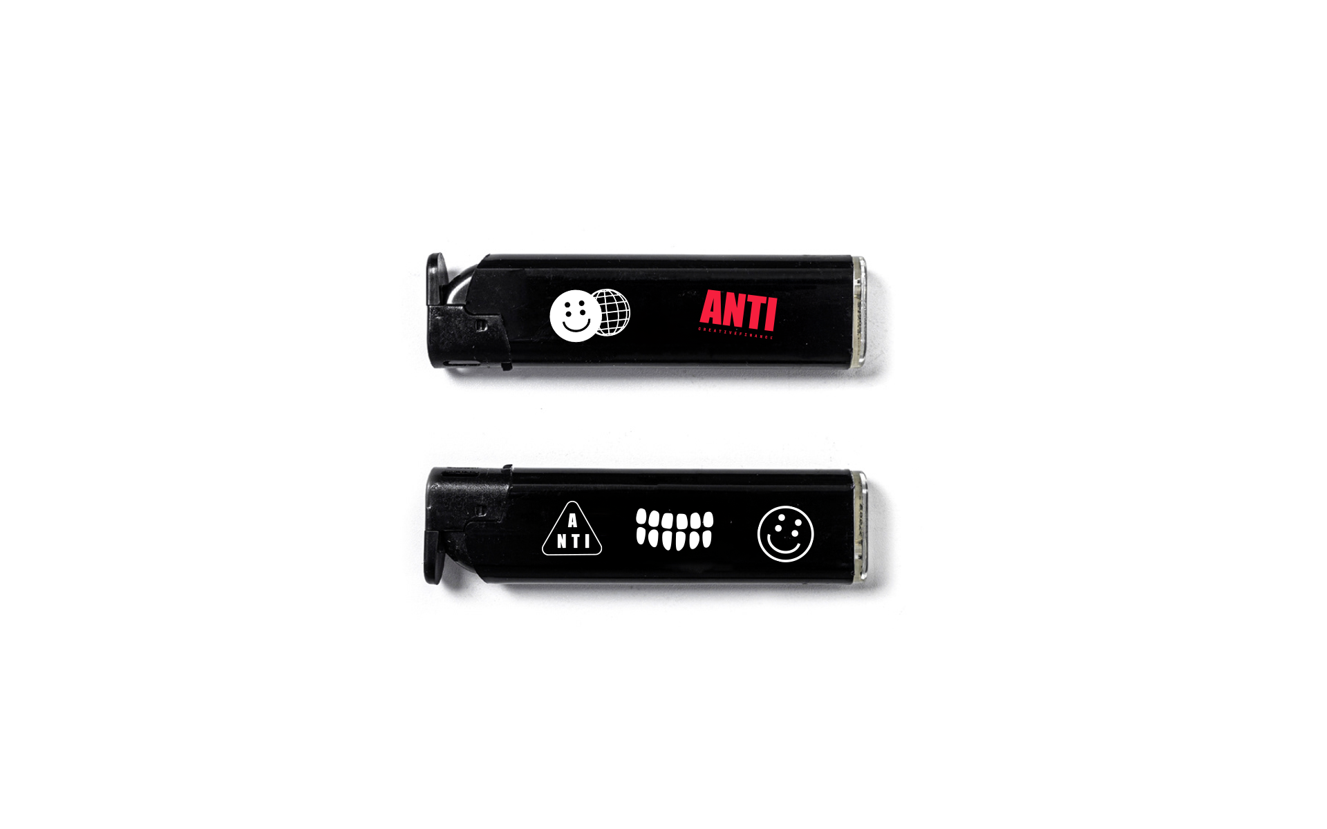
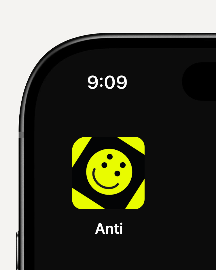
A marca em movimento — aplicações reais que mostram a identidade ANTI funcionando no mundo.

We Are DUX

Esta seção aborda a relação entre ANTI e o Grupo DUX: arquitetura de marca, elementos visuais compartilhados e diretrizes de coexistência entre as marcas do grupo.

Downloads

Every logo version in black and white, as SVG, PNG and PDF. Grab the full pack or individual files.

Full pack anti-logos-nov25.zip 24 logos + readme · SVG + PNG + PDF · 0.6 MB

The white version has a transparent background. In PNG and PDF it looks empty in your system preview and in PDF readers — that is correct. Use it on a dark background.

01

Horizontal

Header, documents, signatures.

PNG 2000 × 611 px

ANTI Horizontal — Black
Black SVG PNG PDF
ANTI Horizontal — White
White SVG PNG PDF
02

Vertical

Large format, covers, primary applications.

PNG 1580 × 2000 px

ANTI Vertical — Black
Black SVG PNG PDF
ANTI Vertical — White
White SVG PNG PDF
03

Wordmark

When the icon does not fit or the brand is already in context.

PNG 2000 × 1115 px

ANTI Wordmark — Black
Black SVG PNG PDF
ANTI Wordmark — White
White SVG PNG PDF
04

Icon

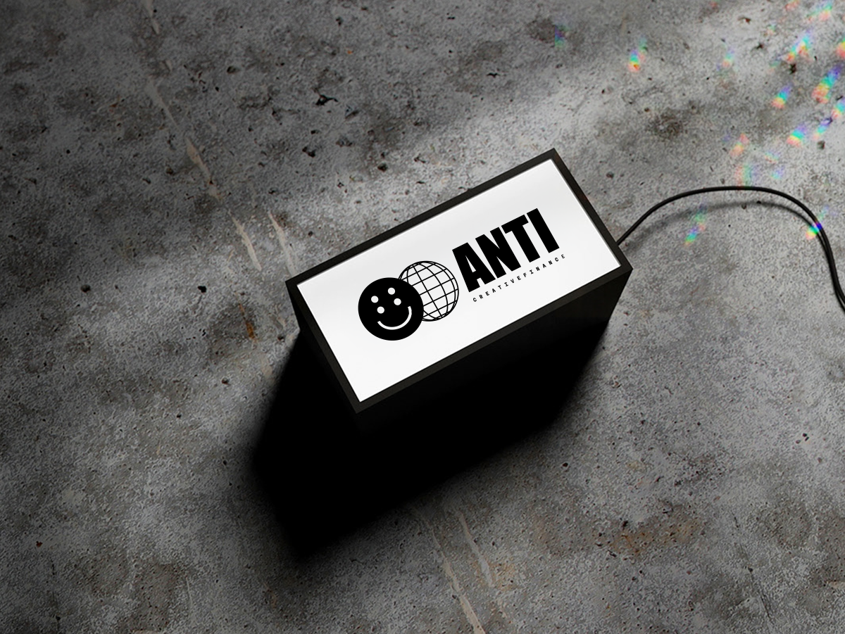
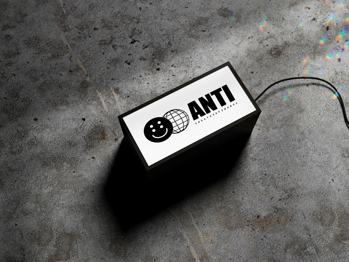
Avatar, button, small sizes. Smile + globe.

PNG 2000 × 1237 px

ANTI Icon — Black
Black SVG PNG PDF
ANTI Icon — White
White SVG PNG PDF